Design + growth
Design, UX & digital marketing
Unify story, UX, and build — so campaigns, product screens, and your site feel like one brand, not three competing versions.
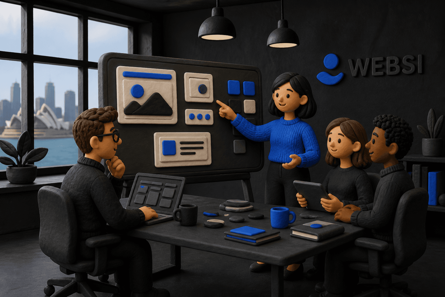
UX, visual design, and funnel thinking in one thread — so ads, site, and product screens feel like one brand, and engineers aren’t guessing at spacing or states.
- Patterns, not one-offs
- SystemsPatterns, not one-offs
- Design meets engineering
- One threadDesign meets engineering
- CTAs wired to analytics
- MeasuredCTAs wired to analytics
Start here
One coherent story from ad click to signup.
If any of these sound familiar, this service is likely worth exploring.
Handoffs keep breaking quality
One thread from discovery to shipped pixels — fewer “that’s not what I meant” loops between design and dev.
Ads and site tell different stories
We align message, proof, and layout so the click, landing, and signup flow feel intentional.
Founders wearing every hat
Prioritised roadmaps: what moves conversion this quarter vs nice-to-have polish later.
What you get
A clear result, not a box of technical parts
We agree on the business outcome first. The tools, scope, and timeline follow from that.
Design systems, not one-offs
Components and states your team reuses — faster pages, fewer inconsistent buttons.
Figma to live without guesswork
Specs engineers can implement — spacing, breakpoints, and real copy in context.
Experiments tied to the funnel
Landing structure and analytics events named per CTA — so you learn from launches, not argue about them.
The plan
What we'll work through together
Handoffs cost quality: vague specs, missing states, campaigns that don’t match the landing page. We stay in the same thread from audience and objections through Figma to live code — naming CTAs for analytics, specifying breakpoints, and keeping experiments tied to a funnel you can actually read.
Tools we can connect
- Figma
- Framer
- Webflow
- React
- Airtable
- Monday.com
What to bring
- Prototype forms with real labels — lorem ipsum hides broken layouts and weak CTAs.
- One obvious primary action per screen; secondary paths are for people who need an exit ramp, not a maze.
How it works
Four simple steps from problem to launch
You always know what we're doing, what you need to review, and what happens next.
Clarify the job
Audience, objections, funnel steps, and the one action you want per screen — before visual polish.
Design systems, not one-offs
Components, variants, and breakpoints your team can reuse on the next page or test.
Ship‑ready craft
Typography, colour, and motion that survive contact with real content and slow devices.
Measure what you ship
Landing structure and event names so post-launch learning is possible — not argued from memory.
What changes
The practical difference after launch
These are the improvements we design toward. We define the exact measures with you during discovery.
- Clearer trust and comprehension across ads, site, and product touchpoints
- Reusable patterns that speed up new pages, tests, and seasonal campaigns
- Experiments grounded in a funnel definition — not one-off guesses
This is usually a good fit if…
- Teams tired of design and build pointing at each other across a wall of Slack threads
- Founders juggling product narrative and growth at the same time
- Companies unifying story and UI after a patchwork of agencies and contractors
Common questions
What you may want to know before we talk
Plain answers to the questions that usually come up first.
Next step
Ready to scope this?
Use the structured brief at /start — or send a short note via contact if you prefer.
Explore
Other services
Most engagements blend a few of these — compare scope, process, and fit on each page.
- Workflow & systemsWorkflow automation & integrationsWe map how work really moves between people and tools, then automate the repeat steps with owners, logs, and fallbacks — so the fix still makes sense in six months.
- Portals & internal toolsCustom business applicationsPortals and internal tools shaped around your roles, approvals, and data — from a thin v1 you can ship to users, to deeper builds when risk demands it.
- Practical AIAI integrations & intelligent automationDrafting, classification, and retrieval where they save hours — wired into tickets, CRM, and internal tools with guardrails, review, and cost you can read.